Trip.com: Book Flights, Hotels
- 4.7
- Rating
- 50.00M
- Installs
- Free
- Price

 Analysis by App-foxy
Planning a trip from a phone can be either pleasantly simple or surprisingly tiring, especially when you are comparing flights, hotels, dates, baggage rules, and cancellation conditions on a small screen. I spent time looking at Trip.com as a travel and local app, focusing not only on how quickly it helps me search but also on how comfortably different people can use it. My overall impression is that it is a broad booking tool with enough choice for many kinds of travelers, although the amount of information can make careful checking essential.
Trip.com is free, developed by Trip.com, and intended for everyone. It has been available since July 31, 2013, and the current version is 8.44.0 for devices running Android 7.0 or later. Its scale is clear from the store presence: it has passed 50 million installs, with an average rating of 4.6 from around 792 thousand ratings and about 3.2 thousand written reviews. Those figures do not tell me whether every booking will be smooth, but they do show that this is an established option rather than a little-known travel experiment.
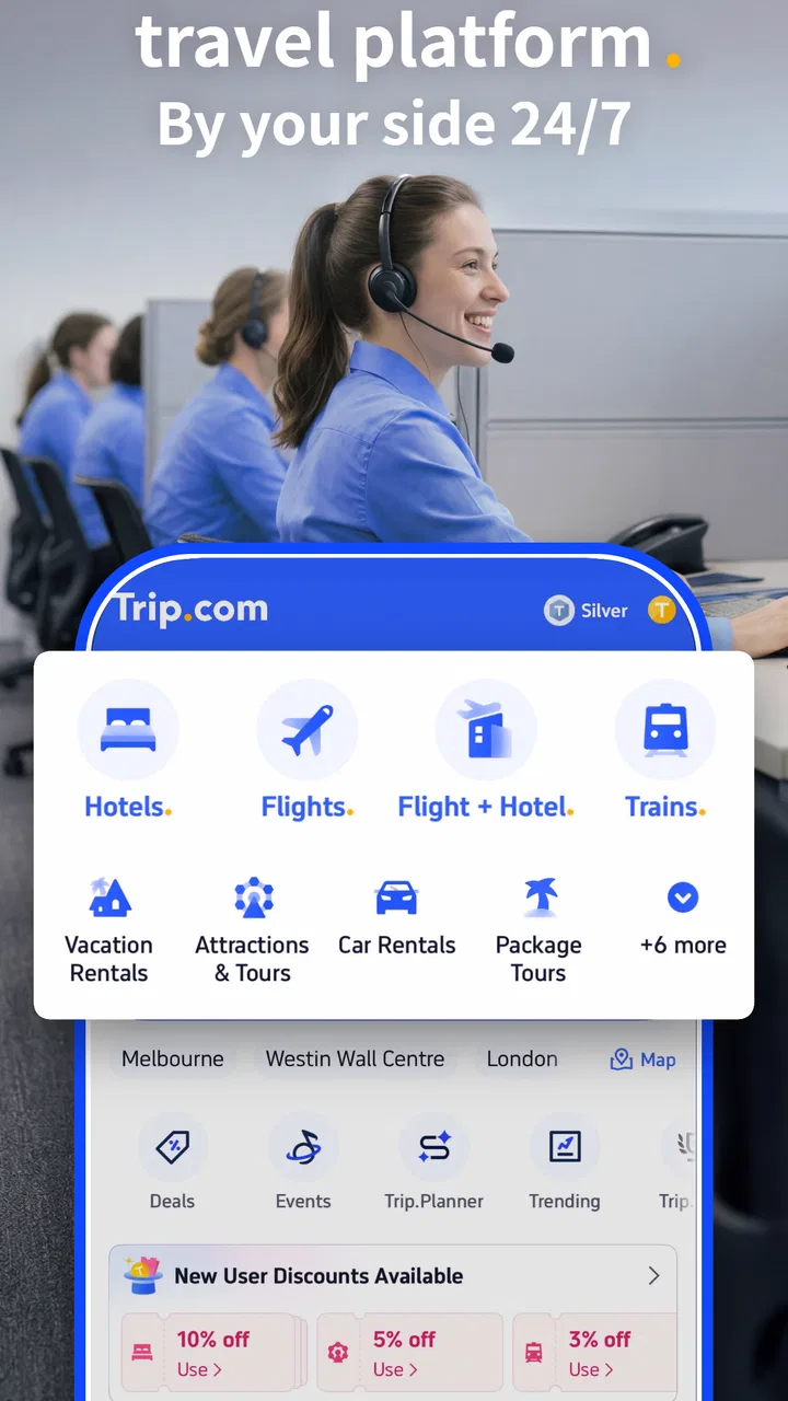
The app combines flight and hotel searching in one place. That combination matters when I am trying to coordinate arrival and accommodation rather than treating each part of a journey separately. It is also useful for travelers who prefer to keep reservations, search results, and trip decisions inside one travel service instead of jumping between an airline app, a hotel website, and a separate comparison tool.
You May Also Like

 AccuWeather: Weather Radar
AccuWeather Review: A Quick, Clear Forecast for Everyday Decisions
For everyday plans, the best forecast is the one you can understand quickly. AccuWeather makes rain timing, radar, and local conditions easy to act on, with a few trade-offs.

 Hill Climb Racing
Why Hill Climb Racing Still Turns Crashes Into One More Run
A tiny car, a bumpy hill and one more upgrade: Hill Climb Racing keeps resurfacing because its simple chaos makes every near-miss feel personal.

 AliExpress - Shopping App
AliExpress Makes Global Shopping Feel Personal, but Shoppers Bear the Risk
AliExpress turns a global marketplace into a pocket-sized discovery engine. Its reach is useful, its shopping loop compelling, and its trade-offs easy to miss.

 Lords Mobile: Kingdom Wars
Lords Mobile Is a Kingdom-Building Routine, Not a Quick Match
A case-by-case verdict on the building, battles, device demands, and social commitments that make Lords Mobile rewarding for some players and exhausting for others.

 PDF Scanner app - TapScanner
TapScanner Makes Paperwork Easier to Capture, Check, and Share
TapScanner makes scanning with a phone feel less like a rescue operation and more like a dependable step in getting work done. Its capture tools are useful, though not flawless.

 Block Blast!
 Shows How Much a Puzzle Game Can Leave Out
A quiet grid game shows why puzzle players increasingly value instant clarity, repeatable skill and low-pressure play—and where the genre still needs to catch up.
More From Our News Desk
View All News


How clearly the app presents travel information
I find that Trip.com’s clearest strength is bringing flight and hotel research into one place, which can make it easier to plan a journey as a whole rather than comparing each piece in isolation. In this section, I look at how the app’s information supports decisions and where the amount of detail calls for a slower read. That distinction matters before considering how different people may interact with the booking process.
Readable search flows, with plenty to process
The most important accessibility question for a booking app is not simply whether I can open it. It is whether I can understand what I am selecting before money or travel time is involved. Trip.com is strongest when I approach it with a clear task: search a route, choose dates, compare options, and inspect the booking details. The travel purpose is easy to understand, but the results themselves can contain many competing details, including times, stops, baggage conditions, fare differences, hotel information, and booking restrictions.
That density is normal for travel shopping, yet it creates a real readability challenge for people who find crowded screens difficult. I recommend slowing down at the comparison stage rather than choosing the first attractive fare. A lower-looking price may not be the best value once I consider the departure time, connections, luggage, room conditions, or flexibility. The app can help me gather options, but I still need to read the less prominent information before confirming.
For someone with limited attention, fatigue, or a preference for simple decision-making, a useful approach is to search one part of the trip at a time. I first establish the route and dates, then review flight timing, and only afterward compare accommodation. Trying to solve every travel decision in one pass makes the interface feel more demanding. Breaking the task into short sessions also reduces the chance of losing track of which dates or room type I intended to choose.
Navigation works best when I prepare first
I find the experience easier when I already know the basic requirements. Having the destination, approximate dates, number of travelers, and preferred departure window ready reduces unnecessary movement through the search process. This is particularly helpful for people who use a screen reader, magnification, voice control, or any method that makes repeated navigation slower. The less exploratory tapping I need to do, the less tiring the booking becomes.
Travel apps often place several related choices close together, and Trip.com is no exception in practical use. I pay close attention to whether I am changing the travel date, the number of passengers, the room arrangement, or a filter. A quick tap can alter the search in a way that is not immediately obvious if I am moving quickly. Reviewing the summary after each major change is a small habit that prevents larger mistakes later.
The app is more suitable for users who want a single broad search space than for someone who wants an extremely stripped-down booking screen. A direct airline or hotel app may feel calmer when I have already chosen a provider and only need to complete a reservation. Trip.com is more useful earlier in the process, when I am still comparing possibilities across travel arrangements.
Information hierarchy matters more than visual polish
When I evaluate readability, I care less about whether a screen looks modern and more about whether the important distinction is obvious. In a travel booking, the crucial details are not just the destination and total cost. I also need to identify whether a flight is direct, what the connection involves, what the accommodation includes, and what restrictions apply. The app is most helpful when I treat those details as a checklist rather than relying on the headline result.
For users who struggle with small text or visual crowding, the best practical strategy is to use the phone’s own display and accessibility settings where available, then verify that enlarged content does not hide the confirmation controls or important fare information. I would not assume that every part of a complex booking screen becomes equally easy to read after enlargement. A larger display can also make a difference, especially when comparing several options side by side in the mind rather than literally on screen.
Language and confidence during booking
A booking app can be technically usable but still stressful if its wording leaves me uncertain. Travel terms such as refundable, changeable, baggage included, or pay later can have very different consequences. I recommend reading these labels in context and checking the final summary before payment. This is especially important for users who are not confident with travel vocabulary or who need extra time to interpret formal conditions.
Trip.com is a good fit for someone willing to review details carefully. It is less ideal for a traveler who wants every choice explained in the simplest possible way or who becomes overwhelmed by multiple fare and room variations. In that situation, booking directly with a familiar airline or hotel may provide a narrower, easier-to-follow path, even if it means comparing fewer providers.
Using the app with different motor, sensory, and situational needs
Travel booking asks a lot of a phone user, from entering destinations to checking dates and reading small-print conditions. I’ll consider how motor, sensory, and situational needs can change that experience, along with practical ways to reduce effort and avoid rushed choices. My focus is on choosing a workflow that fits the traveler, not expecting one app to suit everyone equally.
Motor control and the cost of repeated actions
Booking a trip involves many small interactions: entering destinations, selecting dates, adjusting passengers, applying filters, opening details, and moving through checkout. For someone with tremors, reduced dexterity, joint pain, or limited one-handed control, the problem is not one difficult action but the accumulation of many precise ones. I find that preparing information in advance and avoiding unnecessary filters makes the process more manageable.
Voice input can be useful for entering place names or search terms when typing is uncomfortable, although I would always check the result carefully. Airports and cities can have similar names, and an incorrectly recognized destination is a serious mistake. The same principle applies to date selection: voice or assistive input can reduce effort, but the visible summary deserves a deliberate review before continuing.
People who need larger touch targets may find dense travel screens less comfortable than simpler apps. A larger phone or tablet can help, but it does not remove the need for careful tapping. I prefer completing a booking while seated, with enough time to confirm each selection, rather than trying to do it while walking through a station or balancing luggage. That is not merely a convenience issue; it lowers the chance of selecting the wrong date or fare.
Sensory load during comparison
Travel shopping can be visually and mentally intense because several options may look almost identical while differing in important ways. Users who are sensitive to visual clutter, bright screens, rapid changes, or too many competing choices may benefit from narrowing the search before examining individual results. I use a small set of meaningful preferences rather than opening every available option.
For a person with hearing loss, a phone-based booking workflow can be preferable to relying on spoken announcements or telephone conversations, because the key reservation steps are presented visually. However, travel itself still involves airports, stations, hotel desks, and unexpected changes. An app can organize a booking, but it cannot make every part of the journey equally accessible. I would use it as one part of a wider plan, including saved booking details and a clear record of important times.
Users with low vision should be especially cautious about relying on color or visual emphasis alone when comparing results. The meaningful decision should come from the written details: dates, times, stops, room conditions, and fare rules. I would also avoid making a final choice from a quick glance at a highlighted deal. The most noticeable option is not automatically the most suitable one.
When the surrounding situation changes
Trip.com is most comfortable when I have a stable connection, enough battery, and a quiet moment to concentrate. Real travel is often the opposite. I may be in a crowded terminal, dealing with poor reception, carrying bags, or trying to help another traveler. Those conditions make dense information harder to process and increase the value of preparing before departure.
One practical workflow is to complete the comparison while calm, then keep the relevant booking information easy to reach before leaving home. I do not want my first careful reading of a fare condition to happen in a noisy airport. I also avoid assuming that a booking app alone is a complete travel backup. Important confirmation details should be available in a form I can access if the phone becomes difficult to use or the connection is unreliable.
The app can be particularly useful for caregivers, families, and groups because one person can research flights and hotels in a single place. The trade-off is that group bookings create more opportunities for mistakes. Passenger names, dates, room arrangements, and special needs should be checked individually, not inferred from the general search. A clear shared plan is still necessary when several people depend on the same reservation.
A realistic everyday scenario
Imagine I am arranging a short visit for a relative who tires easily, prefers daytime travel, and needs a hotel close to the destination rather than the cheapest room available. I would begin by searching flights with the desired time window, then compare the number of stops and the practical arrival time. After that, I would look at hotels with location and room information in mind, not just the displayed price.
I would send the relative a concise plan only after checking the final selections: departure and arrival times, accommodation dates, room type, and any conditions that could affect the trip. If the traveler has difficulty reading small text, I would not expect them to navigate the full booking process alone. Instead, I would use the app as the research and organization tool while making the decision together. This is a strong use case because the service brings several travel components into one workflow, but the human review remains essential.
Useful habits that reduce friction
Search with the exact dates and traveler count first, then change one variable at a time so I can understand what caused the results to change.
Compare the complete travel conditions, not only the prominent fare or room price. Timing, stops, luggage, and flexibility can matter more than the first number I see.
Use a larger screen or the phone’s display tools when reading dense details, while checking that enlarged content has not moved important controls out of view.
Pause before payment and read the final summary from top to bottom, especially when booking for another person.
Prepare booking information before reaching a busy terminal, rather than depending on fast navigation in a noisy or stressful setting.
Where the app still creates barriers
The biggest barrier is complexity rather than a single missing convenience. Flights and hotels naturally involve rules, exceptions, and changing availability, so a comparison service cannot make the subject completely simple. Trip.com gives me a broad place to search, but that breadth means I have to do more interpretation than I would inside a single airline or hotel system.
Another limitation is the risk of false confidence. A polished result card can make a choice feel finished before I have read the conditions. This affects everyone, but it matters even more for users who need extra time, use assistive technology, or rely on another person to help interpret the screen. A rushed booking process is not inclusive simply because it can be completed with a few taps.
I would also hesitate to recommend making it the only tool for travelers with complex support needs. If a person requires very specific assistance, has unusual mobility arrangements, or needs detailed confirmation from a provider, direct communication with the airline, hotel, or another specialist service may be more appropriate. Trip.com can help with discovery and comparison, but the most important accommodation details should be confirmed through the channel best equipped to answer them.
Who should choose it, and who may prefer another route
I recommend Trip.com to travelers who want to compare flights and hotels together, who appreciate having many possibilities in one app, and who are comfortable checking conditions before booking. It is also a sensible option for people organizing travel for family or friends, because the search process can be handled centrally rather than split across several services.
I would steer a different way for someone who already knows the exact airline or hotel and values the simplest possible direct relationship. The official provider’s app may be easier for managing an existing reservation or asking a highly specific service question. A specialist travel adviser may be better when accessibility requirements, group logistics, or complicated changes are central to the trip.
The app is free and carries an Everyone age rating, which makes it easy to try without a purchase barrier. Still, free access does not remove the practical cost of mistakes. The value comes from comparing carefully and using the information well, not from accepting the first result that looks attractive.
My inclusive verdict
After looking at Trip.com through the lens of readability, motor effort, sensory load, and real travel conditions, I see it as a capable general travel companion with a clear strength: it brings flight and hotel research into one place. Its large user base and mature presence make it a credible starting point, and the 4.6 average rating suggests that many people find it useful.
My reservation is that broad choice can become a barrier. People who need a quiet, highly guided, or provider-specific experience may feel more comfortable elsewhere. For everyone else, I would use Trip.com as a comparison and planning tool, not as a substitute for reading the final conditions or confirming special requirements.
My recommendation is to use it deliberately: narrow the search, enlarge or simplify the display when needed, review one decision at a time, and keep a separate, accessible record of the completed booking. With those habits, Trip.com is a practical choice for many travelers, including people planning around different abilities and energy levels. Its inclusive value comes less from promising a frictionless journey and more from giving users a flexible place to organize the decisions that make a journey possible.
FAQs for Trip.com: Book Flights, Hotels
01What features does the Trip.com app offer for users planning their travel?
Trip.com provides a comprehensive suite of features for travelers, including flight and hotel booking, car rentals, and train ticket reservations. The app also offers access to exclusive deals, a loyalty program, and a user-friendly interface for itinerary management. Users can explore travel guides and 24/7 customer support to enhance their travel planning.
02Is Trip.com a reliable platform for booking flights and hotels?
Yes, Trip.com is considered a reliable platform with millions of users worldwide. It offers competitive pricing, a wide selection of travel options, and secure payment methods. The app is known for its user-friendly interface and has received positive reviews for its customer service and ease of use in booking travel arrangements.
03How does Trip.com handle cancellations and refunds?
Trip.com provides flexible cancellation policies, but these depend on the airline or hotel partner's terms. Users can manage cancellations directly through the app, and refunds are processed according to the specific terms of the booking. It's crucial to review the cancellation policy at the time of booking to avoid any surprises.
04Can I earn rewards or loyalty points with Trip.com?
Yes, Trip.com has a loyalty program where users can earn Trip Coins. These coins can be redeemed for discounts on future bookings. Users can accumulate points by booking flights, hotels, and other travel services. The app also offers special promotions and deals to help users maximize their savings and rewards.
05Is customer support available through the Trip.com app?
Trip.com offers 24/7 customer support via the app. Users can contact customer service for assistance with bookings, cancellations, or any travel-related inquiries. The app also provides a live chat feature and a comprehensive help center with frequently asked questions and troubleshooting tips.
Pros
- User-friendly interface for easy navigation.
- Comprehensive travel options in one app.
- Competitive pricing with exclusive discounts.
- Reliable customer support available 24/7.
- Personalized recommendations enhance experience.
Cons
- Limited offline functionality for planning.
- Occasional glitches during booking process.
- Some features require an account to access.
- Notifications can be overly frequent.
- Language support could be more extensive.

Trip.com: Book Flights, Hotels
Gallery